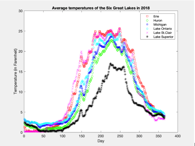
We chose to feature this graph of the average temperatures of all the six great lakes because it portrays all six lakes clearly in one single graph, which makes it easy to read and analyze the data from each lake. When comparing this graph to the other graphs, it portrays a very unique shape. The different colors and lines add an aesthetically pleasing look- unlike most of the other graphs which were represented by only one set colors and lines. The graph also presents all the lines with very close trends but with different peaks of temperature degrees. After the highest temperature peak of all the lines, all the lakes experience a sharp drop in temperature.
 CPS118